ProModal API
作者:陈佳鑫
时间:2023-07-20
cjx-zdy-ui项目仓库
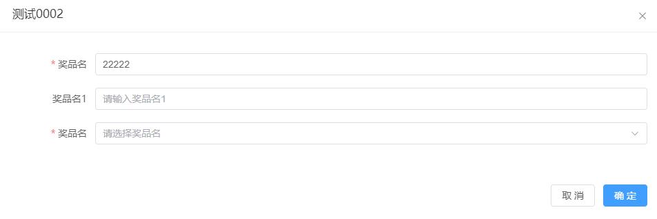
图片展示
代码展示
点击查看代码
<template>
  <el-button type="primary" @click="onAdd">打开Modal框</el-button>
  <ProModal :column="modalColumn" v-model="value" :modal="modalProps" :form="{}" ref="proModalRef" validate
    @submit="onSubmit">
    <!-- <template #footer>
      <div class="dialog-footer" style="text-align: end;">
        <el-button>Cancel</el-button>
        <el-button type="primary">
          Confirm
        </el-button>
      </div>
    </template> -->
  </ProModal>
</template>
<script setup lang="ts">
import { ProModal } from 'cjx-zdy-ui'
import { reactive, ref } from 'vue';
import { EnterFormProps, ProModalInstance } from 'cjx-zdy-ui/lib/src/proModal/types';
import { DialogProps } from 'element-plus/es/components/dialog';

const proModalRef = ref<ProModalInstance>()

const modalColumn: EnterFormProps[] = [
  { label: '奖品名', prop: 'awardName', el: 'input', rules: [{ required: true, message: 'Please input Activity name', trigger: 'blur' }] },
  // {
  //   label: '奖品名1', prop: 'awardName1', render: (scope) => {
  //     return <el-input modelValue={value.awardName1} placeholder="请输入奖品名1" />
  //   },
  // },
  {
    label: '奖品名', prop: 'awardName2', el: 'select',
    enum: [
      { label: '测试奖品', value: '1' }
    ],
    enterProps: {
      clearable: true
    },
    rules: [{ required: true, message: 'Please input Activity name', trigger: 'blur' }]
  },
]

const modalProps = reactive<Partial<DialogProps>>({
  title: '测试Modal'
})

const value = reactive<{ [k: string]: any }>({
  awardName: 11111
})

const onAdd = () => {
  proModalRef.value?.show({ formData: { awardName: '22222' }, title: '测试0002' })
}

const onSubmit = (val: boolean) => {
  console.log(val)
}
</script>
安装
npm i cjx-zdy-ui

yarn install cjx-zdy-ui
引用 main.ts
import CjxUI from 'cjx-zdy-ui'

app.use(CjxUI)
ProModal 属性
| 属性名 | 说明 | 类型 | 必传 | 可选值 | 默认值 |
|---|---|---|---|---|---|
| v-model | from表单中数据 | { [k: string]: any} | false | - | - |
| column | 输入项配置 | EnterFormProps[] | true | - | - |
| validate | 是否由组件validate验证 默认true, 如果传入插槽footer则需要自验证 | boolean | false | boolean | true |
| modal | Dialog 属性,根据 element plus 官方文档来传递 | DialogProps | false | - | - |
| form | Form 属性,根据 element plus 官方文档来传递 | FormProps | false | - | - |
EnterFormProps 属性
| 属性名 | 说明 | 类型 | 必传 | 可选值 | 默认值 |
|---|---|---|---|---|---|
| el | 当前项输入框的类型 | input input-number autocomplete select select-v2 tree-select cascader date-picker time-picker time-select switch slider radio checkbox upload rate | false | - | input |
| label | 当前项标题 | string | true | - | - |
| prop | 当前from项prop属性 | string | true | - | - |
| rules | 当前from项校验规则 | object | false | - | - |
| enum | 枚举类型(字典) | EnumProps[] ((params?: any) => Promise<any>) | false | - | - |
| fieldNames | 指定 label value children 的 key 值 | FieldNamesProps | false | - | - |
| enterProps | 输入项参数,根据 element plus 官方文档来传递,该属性所有值会透传到组件 | any | false | - | - |
| render | 自定义输入项内容渲染(tsx语法),使用render需要搭配v-modal使用实现数据双向绑定 | (scope: RenderScope<T>) => VNode string | false | - | - |
EnumProps 属性
| 属性名 | 说明 | 类型 | 必传 | 可选值 | 默认值 |
|---|---|---|---|---|---|
| label | 选项框显示的文字 | string | true | - | - |
| value | 选项框值 | string | true | - | - |
| disabled | 是否禁用此选项 | boolean | false | - | - |
| tagType | 当 tag 为 true 时,此选择会指定 tag 显示类型 | success info warning danger | false | - | - |
| children | 为树形选择时,可以通过 children 属性指定子选项 | EnumProps[] | false | - | - |
FieldNamesProps 属性
| 属性名 | 说明 | 类型 | 必传 | 可选值 | 默认值 |
|---|---|---|---|---|---|
| label | 选项框显示的文字 | string | true | - | - |
| value | 选项框值 | string | true | - | - |
| children | 选项框子选项 | string | false | - | - |
插槽
| 事件名 | 说明 |
|---|---|
| header | 对话框标题的内容;会替换标题部分,但不会移除关闭按钮。 |
| title | 与 header 作用相同 请使用 header |
| footer | Dialog 按钮操作区的内容 |
事件
| 事件名 | 说明 | 参数 |
|---|---|---|
| submit | 确定按钮触发事件如果使用footer插槽将不会触发 | form 表单数据 |